


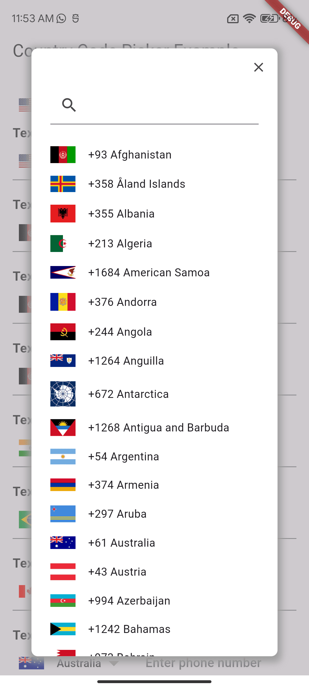
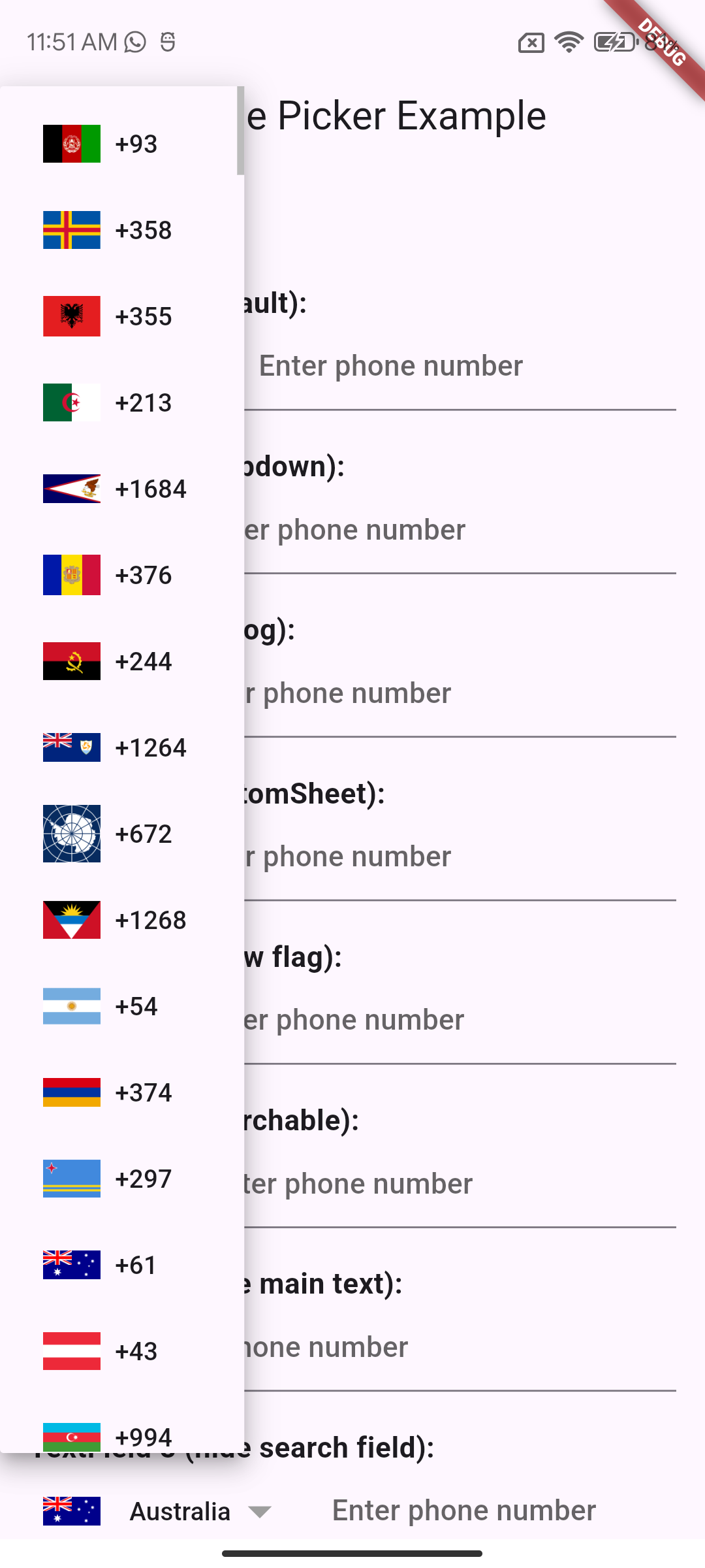
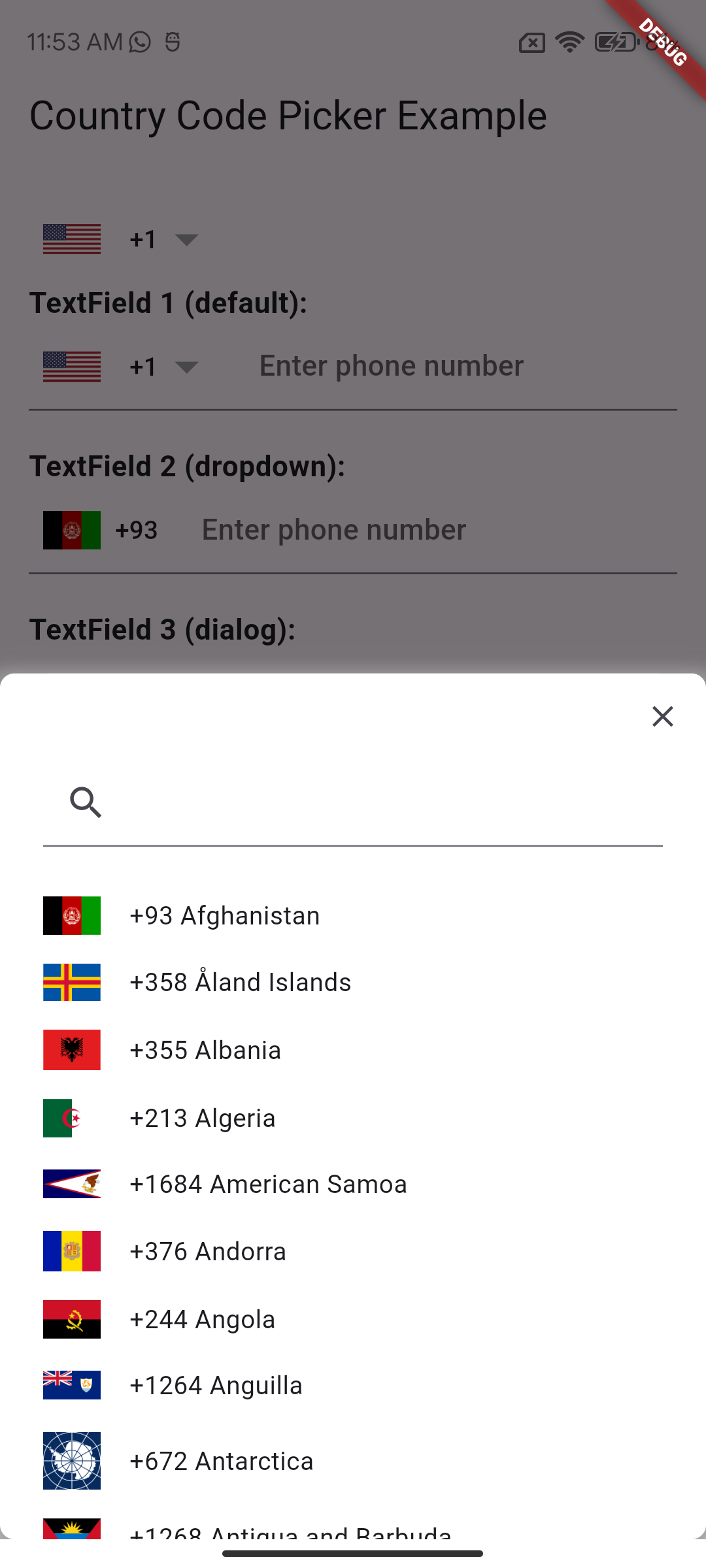
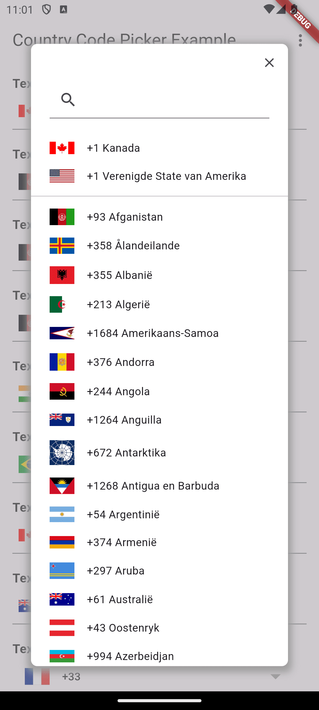
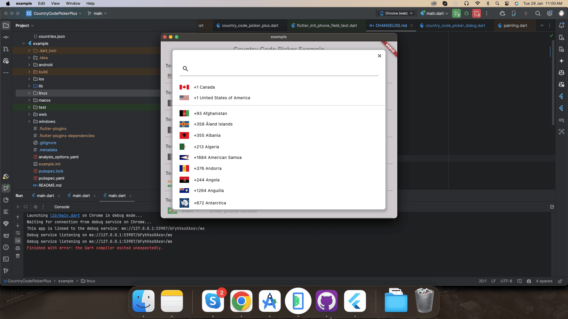
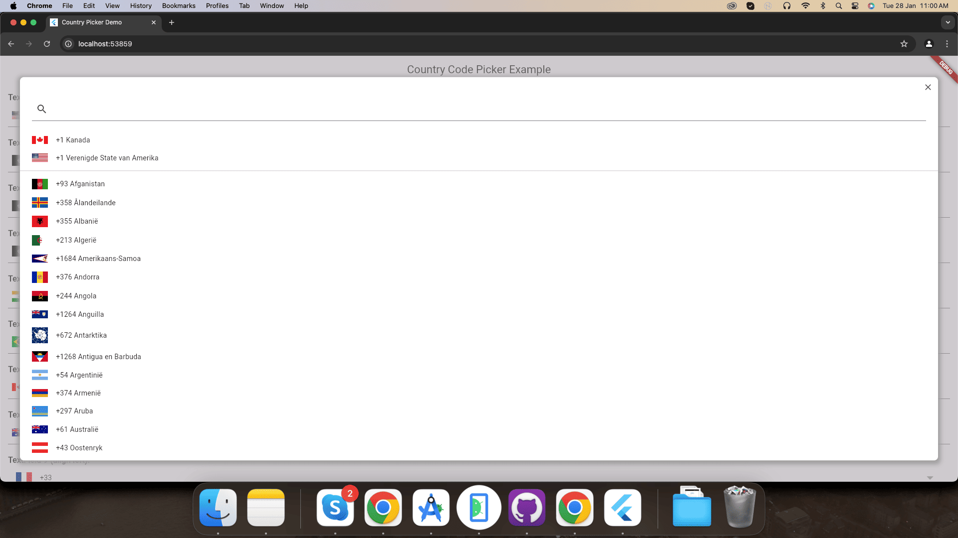
A Flutter package that provides an easy-to-use widget for picking country codes. This widget supports various customization options including displaying country flags, searching countries, and presenting the picker in different modes such as dialog, dropdown, and bottom sheet.
country_code_picker_plus is a Flutter package designed to simplify the process of selecting
country codes in your mobile application. This package provides extensive customization options,
allowing developers to tailor the picker to their specific needs. Whether you want to show country
flags, search for countries, or present the picker in different styles, country_code_picker_plus
has you covered.
Here is a basic example demonstrating how to use the country_code_picker_plus package with various
customization options:
              CountryCodePicker(
                mode: CountryCodePickerMode.dialog,
                onChanged: (country) {
                  print('Country code selected: ${country.code}');
                },
                initialSelection: 'US',
                showFlag: true,
                showDropDownButton: true,
              )
| Mode | Description |
|---|---|
dialog |
Shows the country picker in a modal dialog. |
dropdown |
Shows the country picker as a dropdown menu. |
bottomSheet |
Shows the country picker in a bottom sheet, sliding up from the bottom of the screen. |
This table provides a concise description of the different modes available for
the CountryCodePickerMode property.
 |
 |
 |
|---|---|---|
'CountryCodePickerMode.dialog' |
'CountryCodePickerMode.dropdown' |
'CountryCodePickerMode.bottomSheet' |
| Name | Type | Description |
|---|---|---|
| mode | CountryCodePickerMode | The mode to display the country picker (dialog, dropdown, bottomSheet). |
| onChanged | ValueChanged | callback invoked when the selection changes |
| onInit | ValueChanged | callback invoked during initialization of the widget |
| initialSelection | String | used to set the initial selected value |
| favorite | List | used to populate the favorite country list |
| textStyle | TextStyle | TextStyle applied to the widget button |
| textOverflow | TextOverflow | the button text overflow behaviour |
| dialogSize | Size | the size of the selection dialog |
| countryFilter | List | uses a list of strings to filter a sublist of countries |
| showOnlyCountryWhenClosed | bool | if true it'll show only the country |
| alignLeft | bool | aligns the flag and the Text to the left |
| showFlag | bool | shows the flag everywhere |
| showFlagMain | bool | shows the flag only when closed |
| showFlagDialog | bool | shows the flag only in dialog |
| flagWidth | double | the width of the flags |
| flagDecoration | Decoration | used for styling the flags |
| comparator | Comparator | use this to sort the countries in the selection dialog |
| hideSearch | bool | if true the search feature will be disabled |
| padding | EdgeInsetsGeometry | the padding applied to the button |
| showCountryOnly | bool | true if you want to see only the countries in the selection dialog |
| searchDecoration | InputDecoration | decoration applied to the TextField search widget |
| searchStyle | TextStyle | style applied to the TextField search widget text |
| emptySearchBuilder | WidgetBuilder | use this to customize the widget used when the search returns 0 elements |
| builder | Function(CountryCode) | use this to build a custom widget instead of the default FlatButton |
| enabled | bool | set to false to disable the widget |
Add localization support to your Country Code Picker by including CountryLocalizations.delegate in your app delegates.
MaterialApp(
  // Add supported locales
  supportedLocales: const [
    Locale('af'), // Afrikaans
    Locale('am'), // Amharic
    Locale('ar'), // Arabic
    Locale('az'), // Azerbaijani
    Locale('be'), // Belarusian
    Locale('bg'), // Bulgarian
    Locale('bn'), // Bengali
    Locale('bs'), // Bosnian
    Locale('ca'), // Catalan
    Locale('cs'), // Czech
    Locale('da'), // Danish
    Locale('de'), // German
    Locale('el'), // Greek
    Locale('en'), // English
    Locale('es'), // Spanish
    Locale('et'), // Estonian
    Locale('fa'), // Persian
    Locale('fi'), // Finnish
    Locale('fr'), // French
    Locale('gl'), // Galician
    Locale('ha'), // Hausa
    Locale('he'), // Hebrew
    Locale('hi'), // Hindi
    Locale('hr'), // Croatian
    Locale('hu'), // Hungarian
    Locale('hy'), // Armenian
    Locale('id'), // Indonesian
    Locale('is'), // Icelandic
    Locale('it'), // Italian
    Locale('ja'), // Japanese
    Locale('ka'), // Georgian
    Locale('kk'), // Kazakh
    Locale('km'), // Khmer
    Locale('ko'), // Korean
    Locale('ku'), // Kurdish
    Locale('ky'), // Kyrgyz
    Locale('lt'), // Lithuanian
    Locale('lv'), // Latvian
    Locale('mk'), // Macedonian
    Locale('ml'), // Malayalam
    Locale('mn'), // Mongolian
    Locale('ms'), // Malay
    Locale('nb'), // Norwegian Bokmål
    Locale('nl'), // Dutch
    Locale('nn'), // Norwegian Nynorsk
    Locale('no'), // Norwegian
    Locale('pl'), // Polish
    Locale('ps'), // Pashto
    Locale('pt'), // Portuguese
    Locale('ro'), // Romanian
    Locale('ru'), // Russian
    Locale('sd'), // Sindhi
    Locale('sk'), // Slovak
    Locale('sl'), // Slovenian
    Locale('so'), // Somali
    Locale('sq'), // Albanian
    Locale('sr'), // Serbian
    Locale('sv'), // Swedish
    Locale('ta'), // Tamil
    Locale('tg'), // Tajik
    Locale('th'), // Thai
    Locale('tk'), // Turkmen
    Locale('tr'), // Turkish
    Locale('tt'), // Tatar
    Locale('uk'), // Ukrainian
    Locale('ug'), // Uyghur
    Locale('ur'), // Urdu
    Locale('uz'), // Uzbek
    Locale('vi'), // Vietnamese
    Locale('zh'), // Chinese
  ],
  // Add localization delegates
  localizationsDelegates: const [
    CountryLocalizations.delegate,
    GlobalMaterialLocalizations.delegate,
    GlobalWidgetsLocalizations.delegate,
  ],
  // ... other MaterialApp properties
)
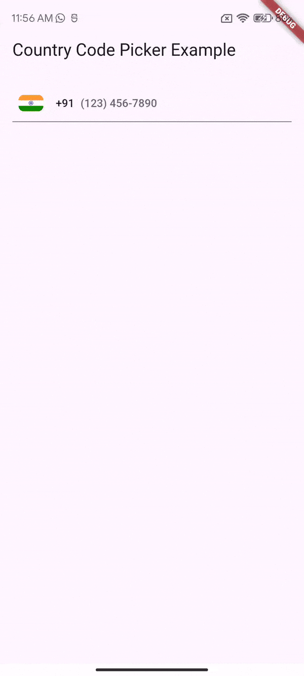
This widget allows users to enter a phone number with a country code. It validates the phone number according to the country code and formats the phone number.
- Validate Phone Number: Validates the phone number according to the country code.
- Format Phone Number: Automatically formats the phone number.
PhoneInputField(
decoration: const InputDecoration(
labelText: 'Phone number',
hintText: '91 123-456-7890',
),
onPhoneNumberValidated: (isValid, phoneNUmber) {
if (isValid) {
debugPrint('Phone number: ${phoneNUmber!.number}');
debugPrint(
'Internationalized phone number: ${phoneNUmber.internationalizedPhoneNumber}');
debugPrint('ISO code: ${phoneNUmber.isoCode}');
} else {
debugPrint('Invalid phone number');
}
})
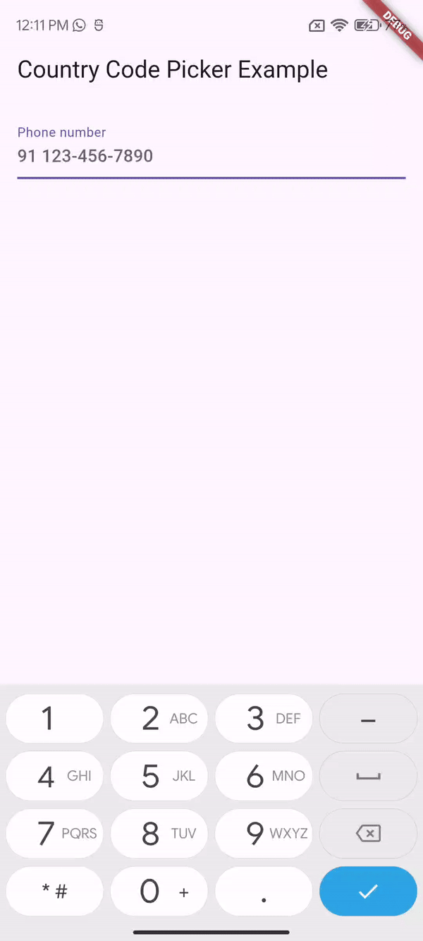
This section describes the PhoneInputField widget with its features and provides a sample code
snippet on how to use it.
| Mobile Application | Desktop Application | Web Application |
|---|---|---|
 |
 |
 |
  |
   |
 |
Contributions of any kind are more than welcome! Feel free to fork and improve country_code_picker_plus in any way you want, make a pull request, or open an issue.
Thanks goes to these wonderful people ✨✨ :
 YudizAndroidNaresh 💻 📖 |
This project follows the all-contributors specification. Contributions of any kind welcome!
First of all, thank you for considering to get involved. You are a real superstar ⭐ and we ❤️ you!
Use the configured Github issue report template when reporting an issue. Make sure to clearly state your observations and expectations so we can understand your needs and troubleshoot effectively.
We're happy to discuss and talk about ideas. Post your questions on StackOverflow.
